PROJECT: Explorer-1 is the design system behind NASA's Jet Propulsion Laboratory web ecosystem: the public website, the Space intranet, the Education Portal, and the WCP lab group sites. Published as a live, versioned Digital Style Guide, it defines the foundations every JPL digital surface is built from: color, typography, layout, containers, and a full library of production UI components.
ROLE: Lead Designer. The system was inherited mid-life, already in production. The work was to take a visual language that had drifted out of sync and make it cohere: auditing what existed, reconciling the inconsistencies, introducing the systems that were missing, and standardizing the component library hand in hand with the developers who shipped it.
DELIVERABLES: A reconciled and extended design system: a new tiered color-family architecture, an adaptive desktop-and-mobile type scale, a documented responsive grid and container system, a standardized icon set, and a full component library (CTAs, links, heroes, carousels, text modules, and mission components) fixed and unified across desktop and mobile.
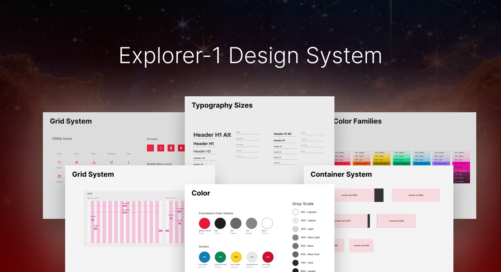
About the System
The Explorer-1 design system arrived already in production. The components existed, but the visual language underneath them had drifted. Type sizes, color usage, and spacing decisions had accumulated over time without a unifying logic, so the pieces no longer spoke the same language.
The first work wasn't to add anything. It was to audit: to map every component and surface every inconsistency before changing a single token. Founding a system is a blank page. Reconciling one that is already shipping, already has dependencies, and has fallen out of sync is harder. It means reverse-engineering the original intent, repairing the connective tissue, and rebuilding the logic so the system holds together by rule rather than by individual decision.
What follows are the systems introduced and the components standardized to make the pieces connect.
Color System
Color was one of the biggest sources of drift applied case by case rather than from a shared source. Beyond fixing individual usages, the system needed a real foundation.
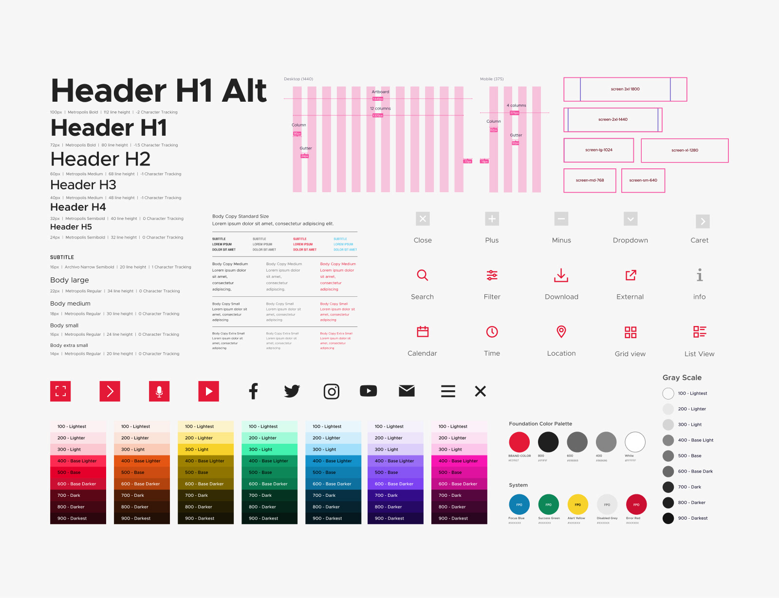
On top of the families sit the working foundations: a brand color (JPL Red) anchored to a structured greyscale, a constrained set of text colors so type color is never a one-off choice, and a complete set of system-state colors (focus, success, warning, disabled, and error) for consistent, predictable interactive feedback.
Tiered color-family architecture
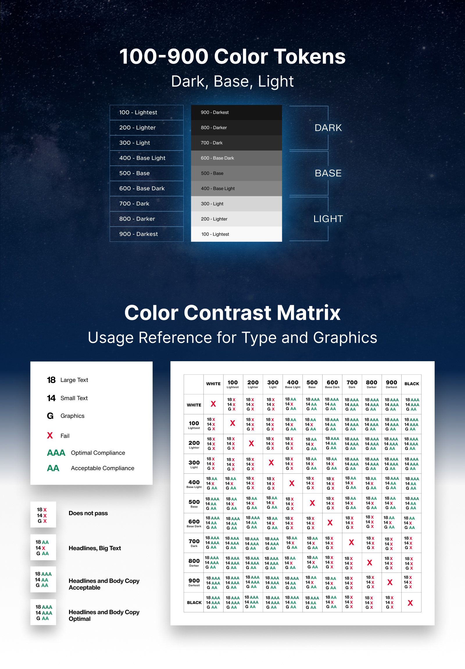
A nine-step ramp per hue, from 100 Lightest through 500 Base to 900 Darkest, across the full spectrum. Each family is organized on a Dark / Base / Light logic, so the step number carries meaning. It tells you not just which shade, but how to use it. This replaced ad hoc color with a predictable, scalable token structure where every shade has a defined place and name, and color decisions become systematic rather than improvised.
The Contrast Matrix
A tiered palette is only conformant if the pairings hold up. To make accessibility a built-in property of the system rather than a manual check, every token was tested against every other token and documented in a Color Contrast Matrix.
The matrix scores each pairing against WCAG thresholds across three real use cases: large text (18px), small text (14px), and graphics. Each pairing is marked as a fail, acceptable (AA), or optimal (AAA) result. The outcome is a single reference that answers the everyday question designers and developers actually ask: can I put this color on that one, for this kind of element? Instead of guessing or re-checking contrast by hand, anyone using the system reads it straight off the matrix, so conformant pairings are the default, not the exception.
An Adaptive Typography Scale
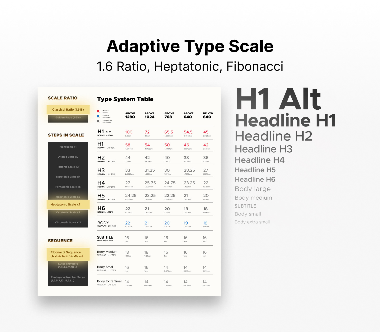
Fixed type breaks across JPL's range of surfaces. A scale that reads on a 1440px public site falls apart on a 375px phone, and the same hierarchy has to work across the public web, the intranet, the Education Portal, and the lab sites.
Defined typography as a fully specified, responsive system rather than a set of fixed values. The scale runs from H1 (100px Metropolis Bold, 112 line-height, -2 tracking) down through H5, plus four body sizes, with a parallel mobile ramp that re-ratios the entire hierarchy (H1 dropping to 48px) so proportion and legibility hold from desktop to phone. Metropolis carries the hierarchy; Archivo Narrow handles subtitles. Every step is documented with size, weight, line-height, and tracking.
A Responsive Layout Foundation
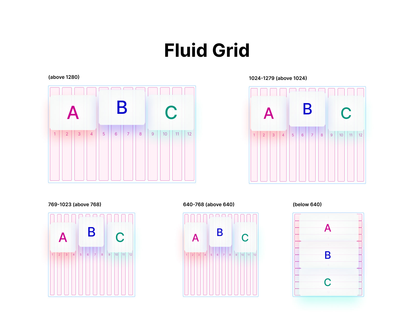
A type scale only coheres if layout shares its logic. The system pairs the typography to a fluid grid and a named container system.
The grid is built on 12 columns that hold their proportions as the viewport changes. Across the larger tiers (above 1280, then 1024 to 1279, 769 to 1023, and 640 to 768) the columns narrow fluidly while content blocks keep their assigned spans, so layout stays consistent without redesigning at every size. Below 640 the grid reflows, stacking blocks to full width for mobile. Above it sits a container system spanning six named breakpoints, from screen-sm-640 through screen-3xl-1800, so every surface scales predictably within the same framework.
Standardizing the Component Library
Foundations only matter if the components built on them are consistent. Working alongside the developers who shipped the system, the full UI library was fixed and standardized, so every component drew from the same source of truth.
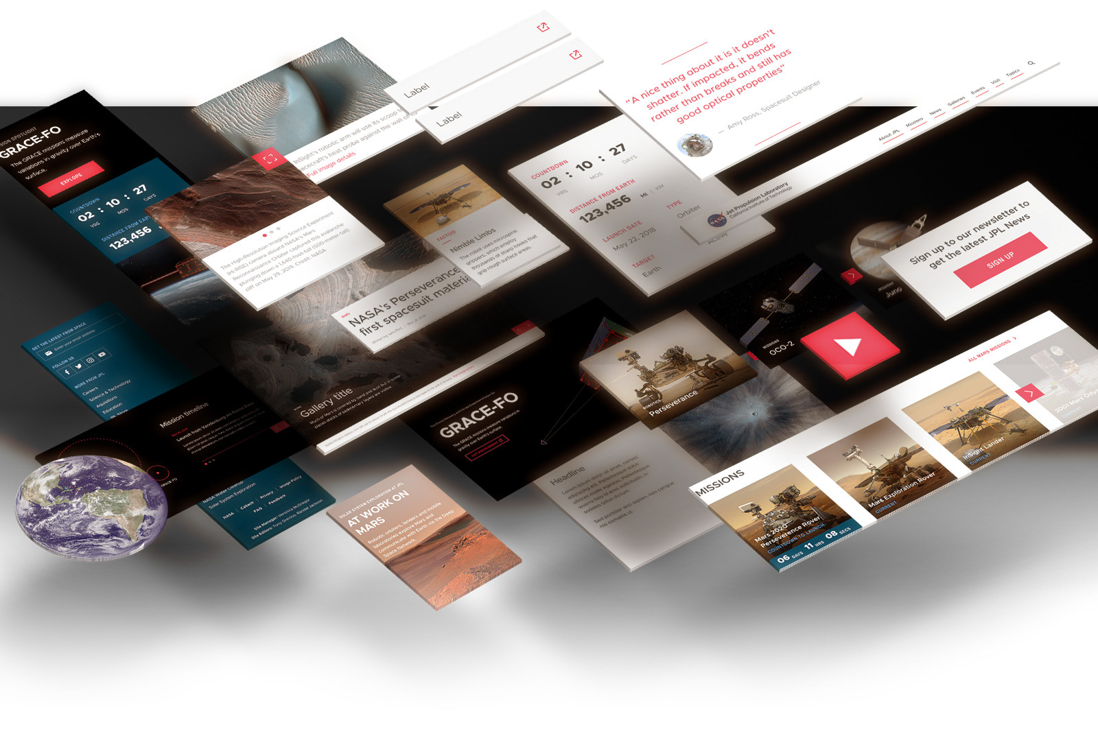
This spanned the complete set: CTAs with full state matrices (default, hover, disabled, including dedicated dark-background variants), link types and states, share modules, and the larger content modules: heroes (mission, topic, article), carousels (article, topic, mission, with defined hover states), text modules (article headlines, pull quotes, newsletter signup, resource links), and mission components (teaser, stats, timeline, spotlight). Each was unified across desktop and mobile and documented with its interaction states.
Explorer-1's final documentation lived in Storybook, specked component by component alongside the developers who built it, so the system stayed true from design file to shipped code...
The Resolution: A System That Connects
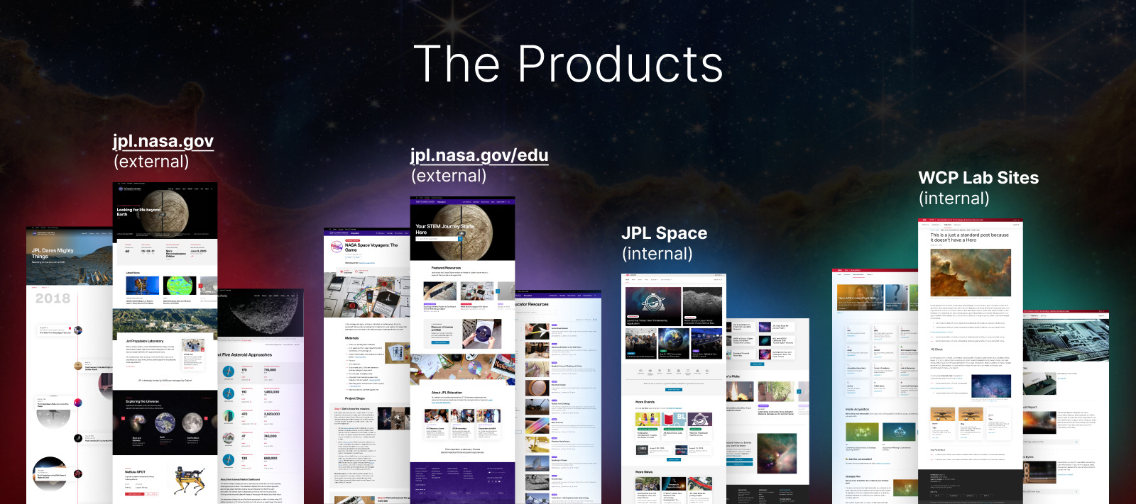
Explorer-1 supports four products: the public jpl.nasa.gov, the education portal at jpl.nasa.gov/edu, the internal JPL Space intranet, and the internal WCP Lab Sites. These span external and internal use and serve different audiences, from the public to lab staff.
Each product is built on the same reconciled foundations: the same color families, the same adaptive type scale, the same grid, and the same standardized components. The system adapts to each context without breaking, which confirms that the underlying logic holds.
The system was inherited drifting and handed on coherent, supporting four distinct products from one shared source of truth.